
Overview

Solution
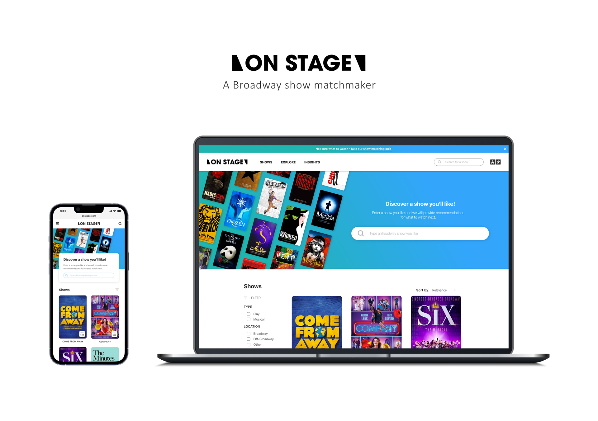
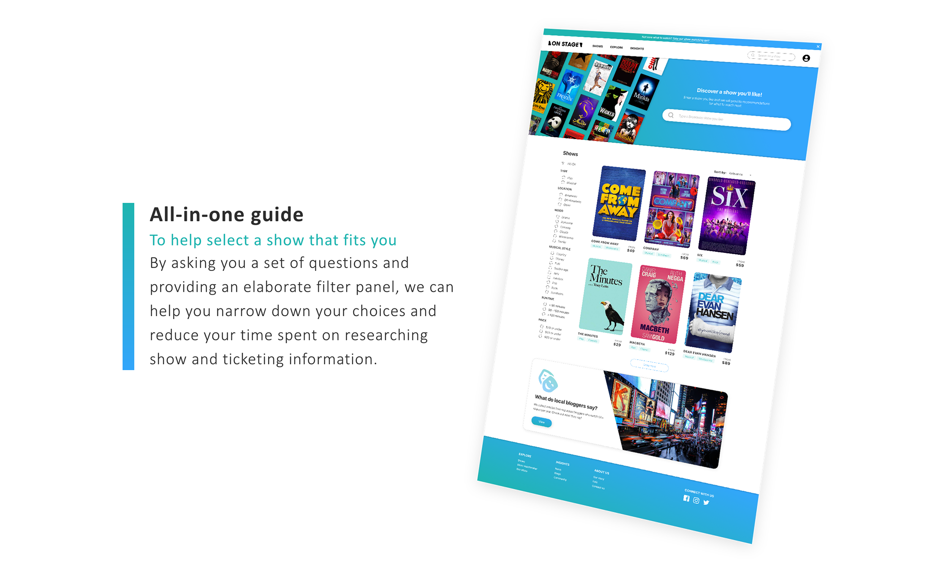
I designed an all-in-one theater information platform that has multiple ways of guiding infrequent Broadway visitors to find a show that fits their preference.
Approach

Design outcome
Discover
Interview
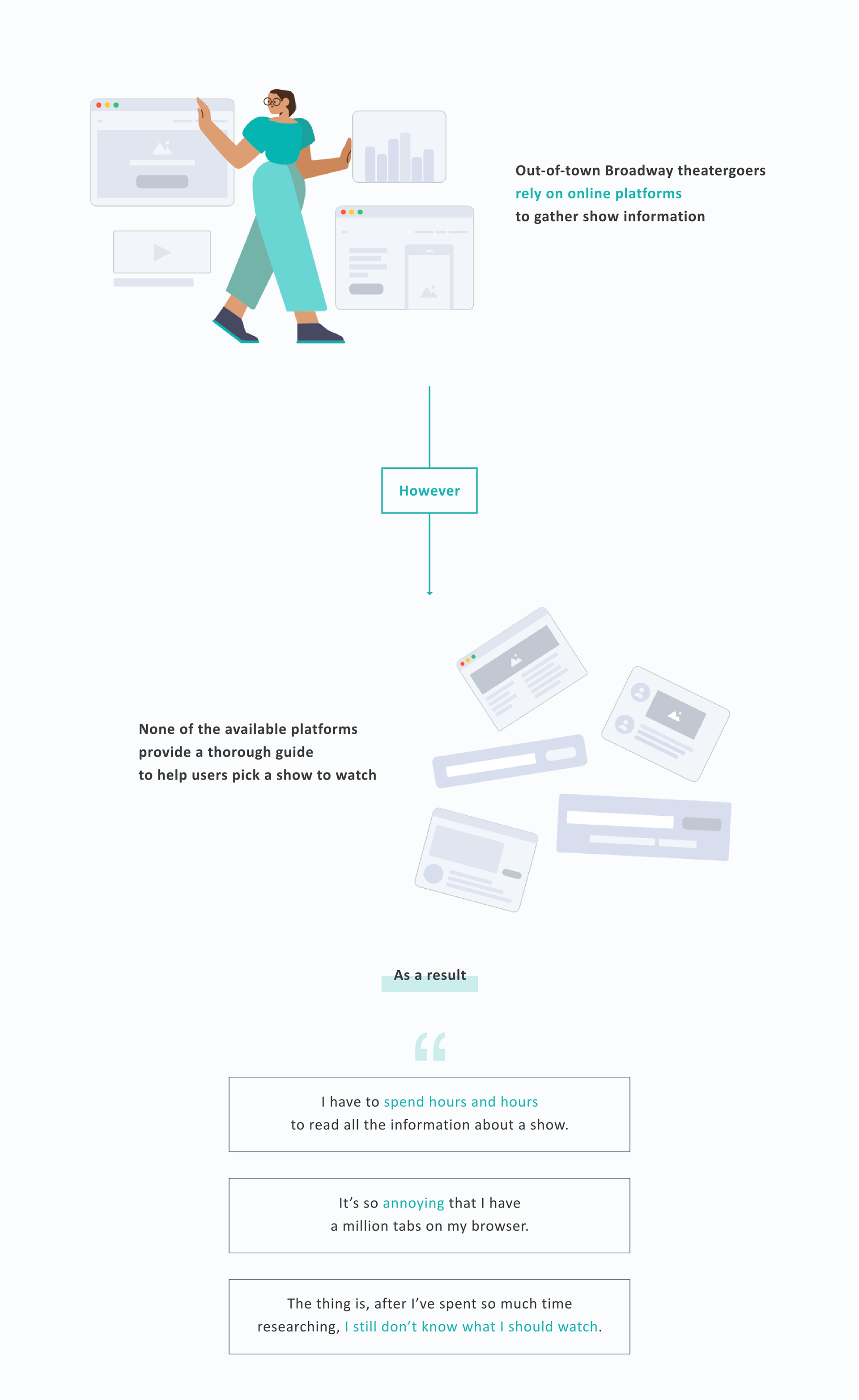
To better understand the show selection experience of out-of-town theatergoers, I conducted in-depth interviews with 5 theatergoers who do not live in New York and had attended at least 1 Broadway show in the past 3 years.
Key research questions
• How do you decide which shows to attend?
• What pain points exist when you're browsing shows?
• What do you need to know about a show to feel confident about making a purchase?
I synthesized the results and gained the following insights:
• They ask people they know or strangers on social media theater groups like Facebook or Reddit for more personalized suggestions.
• Users need a more specific guide to help them pick shows (e.g. is the show family friendly?)
• 4 of the participants said the show selection process can take up to 2-4 weeks
Survey
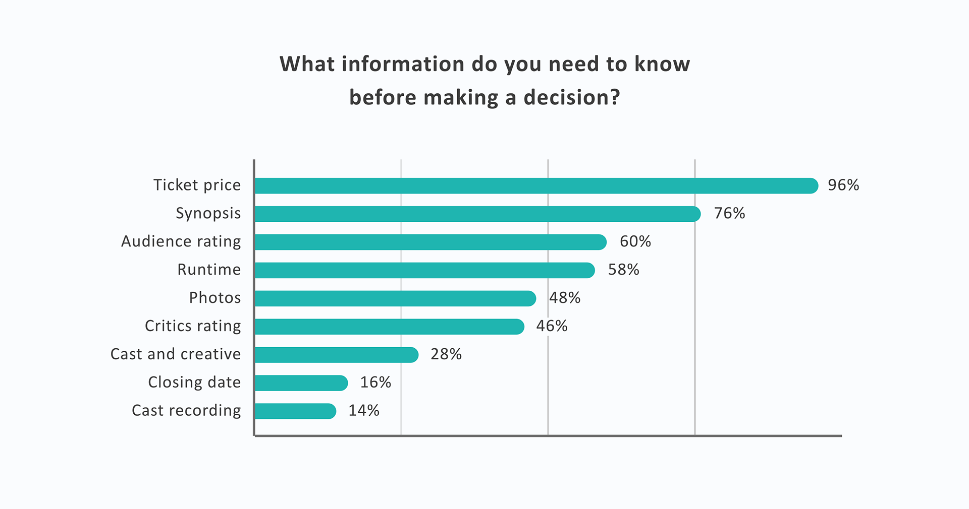
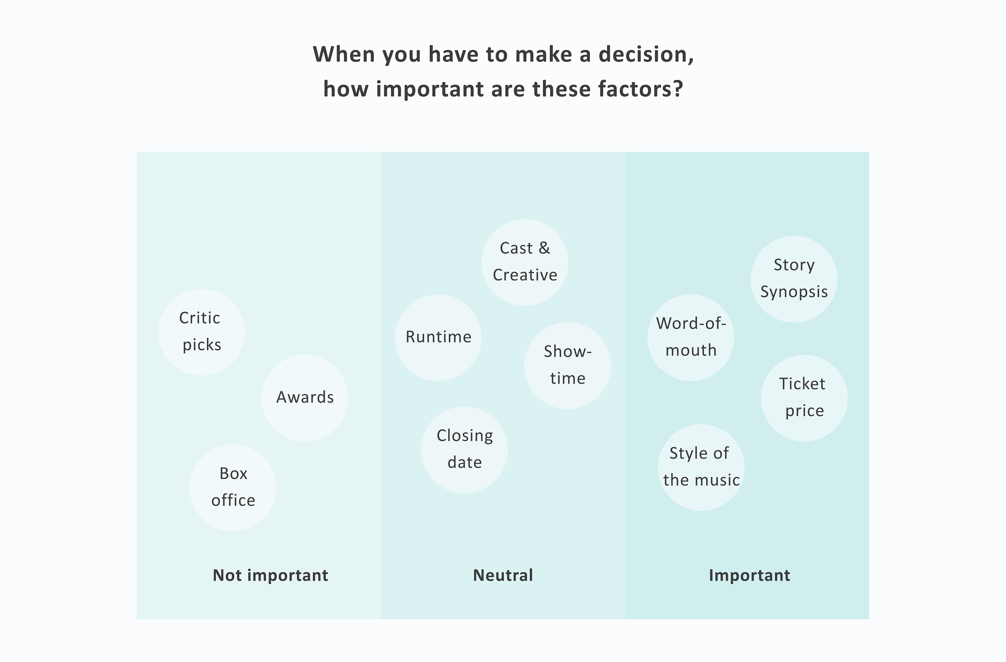
To measure what information is essential to out-of-town theatergoers qualitatively, I conducted a survey and received 50 responses. Here are the findings:
Competitive analysis
I analyzed and compared different websites that offer Broadway show information in order to find out what they were doing right and what they were doing wrong.
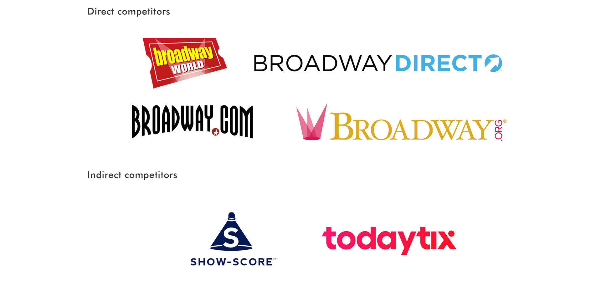
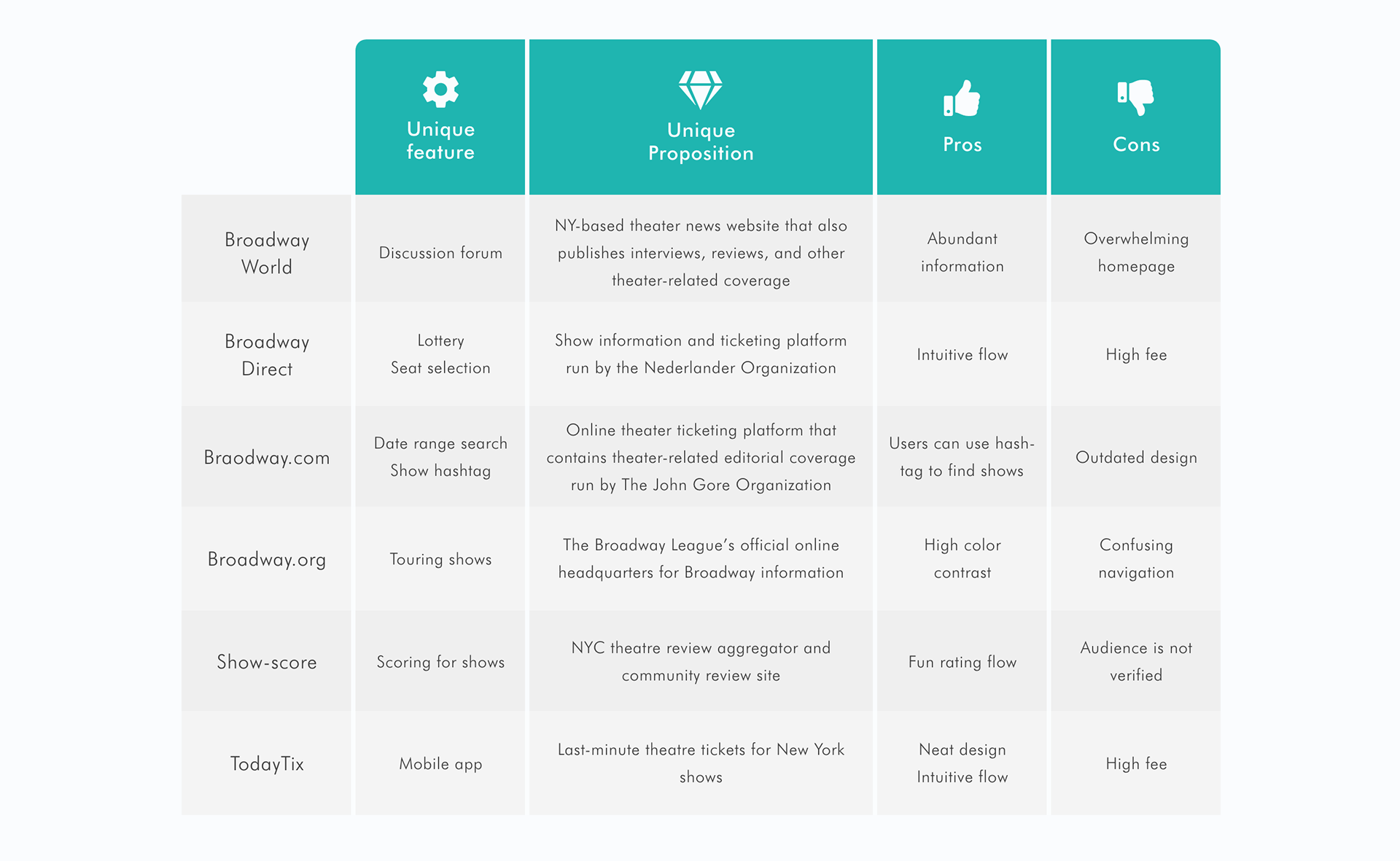
After analyzing both direct and indirect competitors' websites and comparing their features, here are some of the insights I synthesized from the results:
• None of them offer price comparison.
• Most of the websites offer simple filter options that categorize shows by type (play or musical), location (Broadway, Off-Broadway etc).
• None of them have more specific filters.
Define
Persona
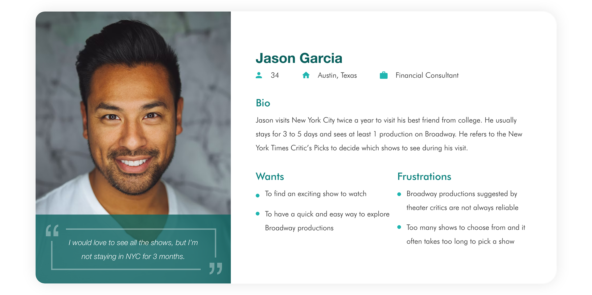
To better empathize with the users, I synthesized the interview and survey results and devised the following persona:
Empathy map
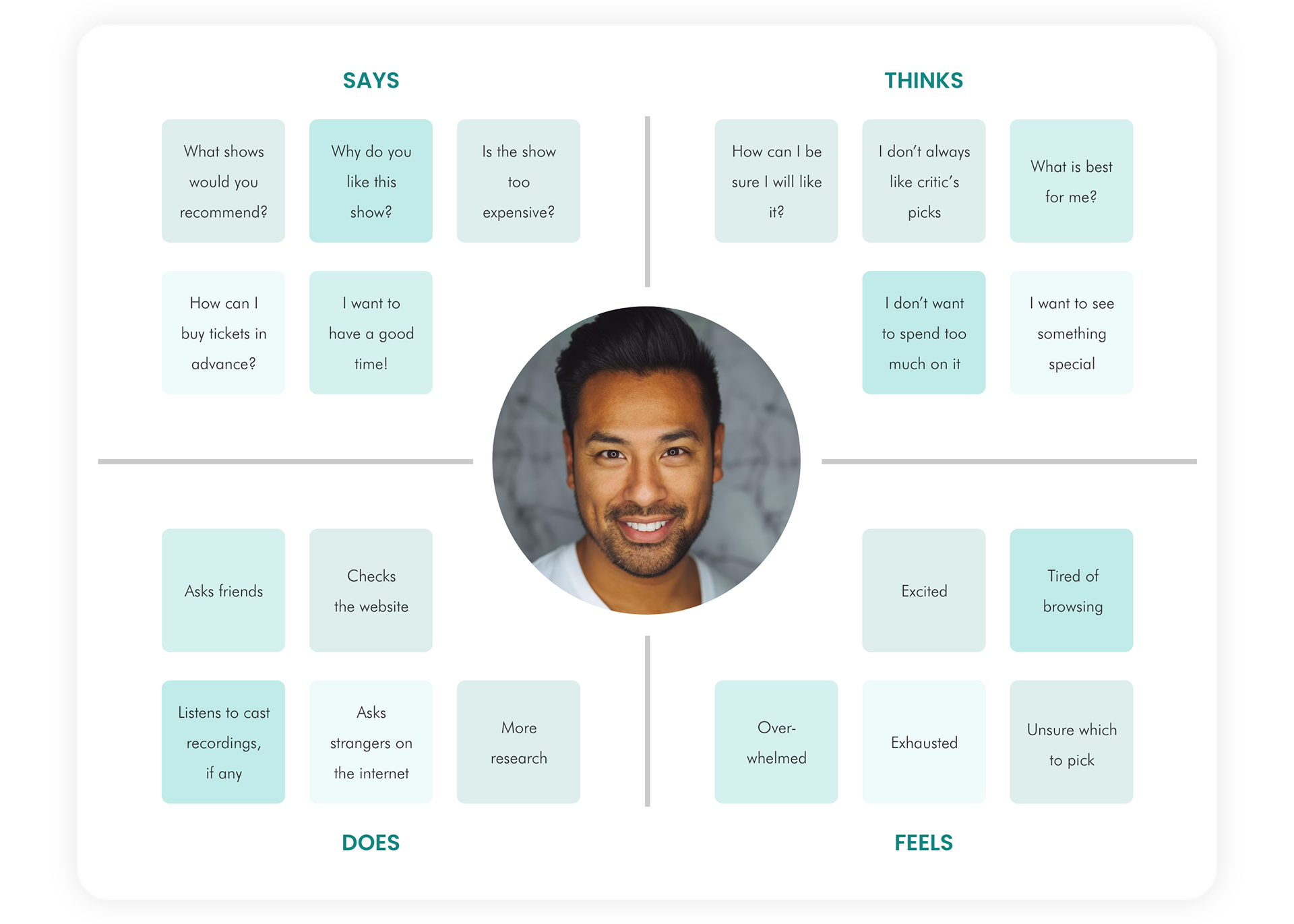
To categorize and make sense of the research, I created an empathy map for the persona to visualize user attitudes and behaviors so that I can have a deeper understanding of end users.
User journey
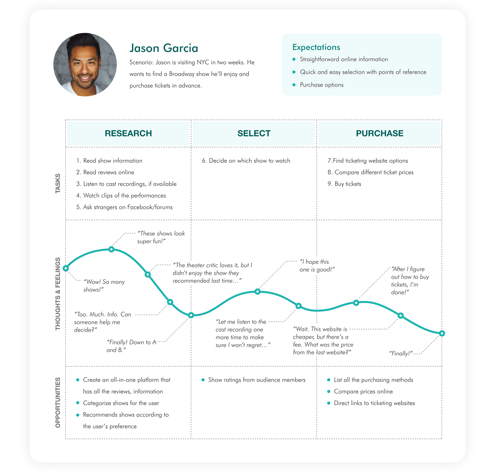
Based on the persona, I created a user journey map to dive into how the current show search experience affects users’ emotions, and what opportunities the product can seize.
Ideate
With a better understanding of the problem out-of-town theatergoers are facing, and how it negatively affects them emotionally, I moved on to turn my findings into potential solutions.
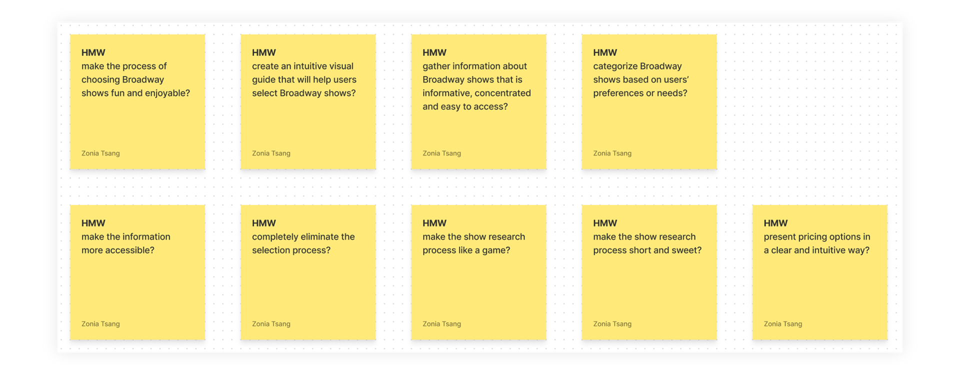
How Might We
I used How Might We to ensure the ideation process is targeting the right problems.
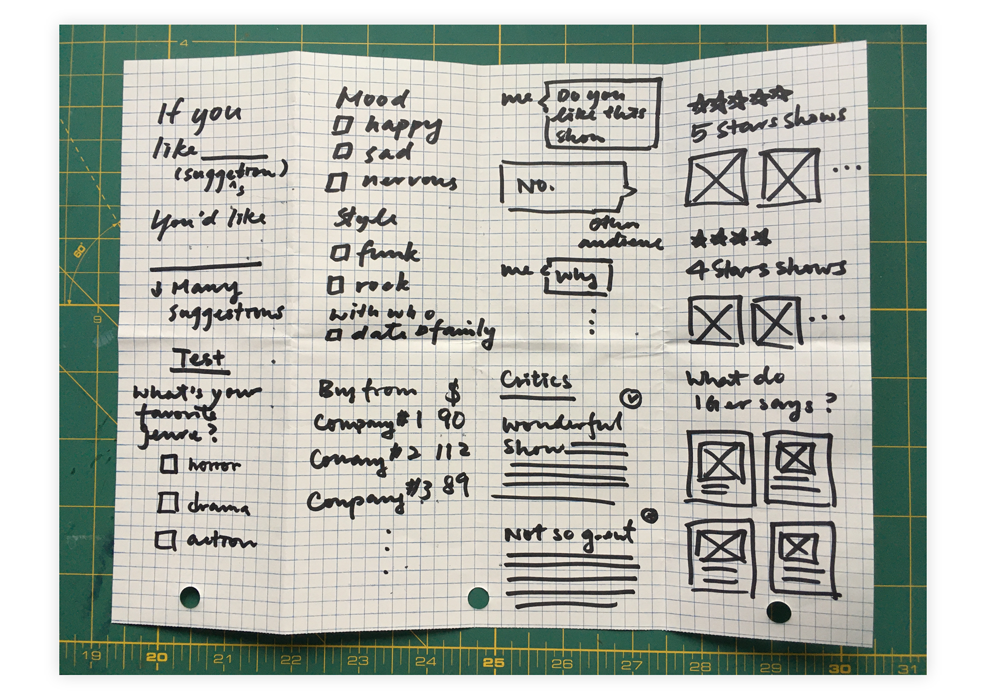
Crazy 8's
I used Crazy 8's to help flesh out some ideas and prevent myself from overthinking the practicality of each idea.
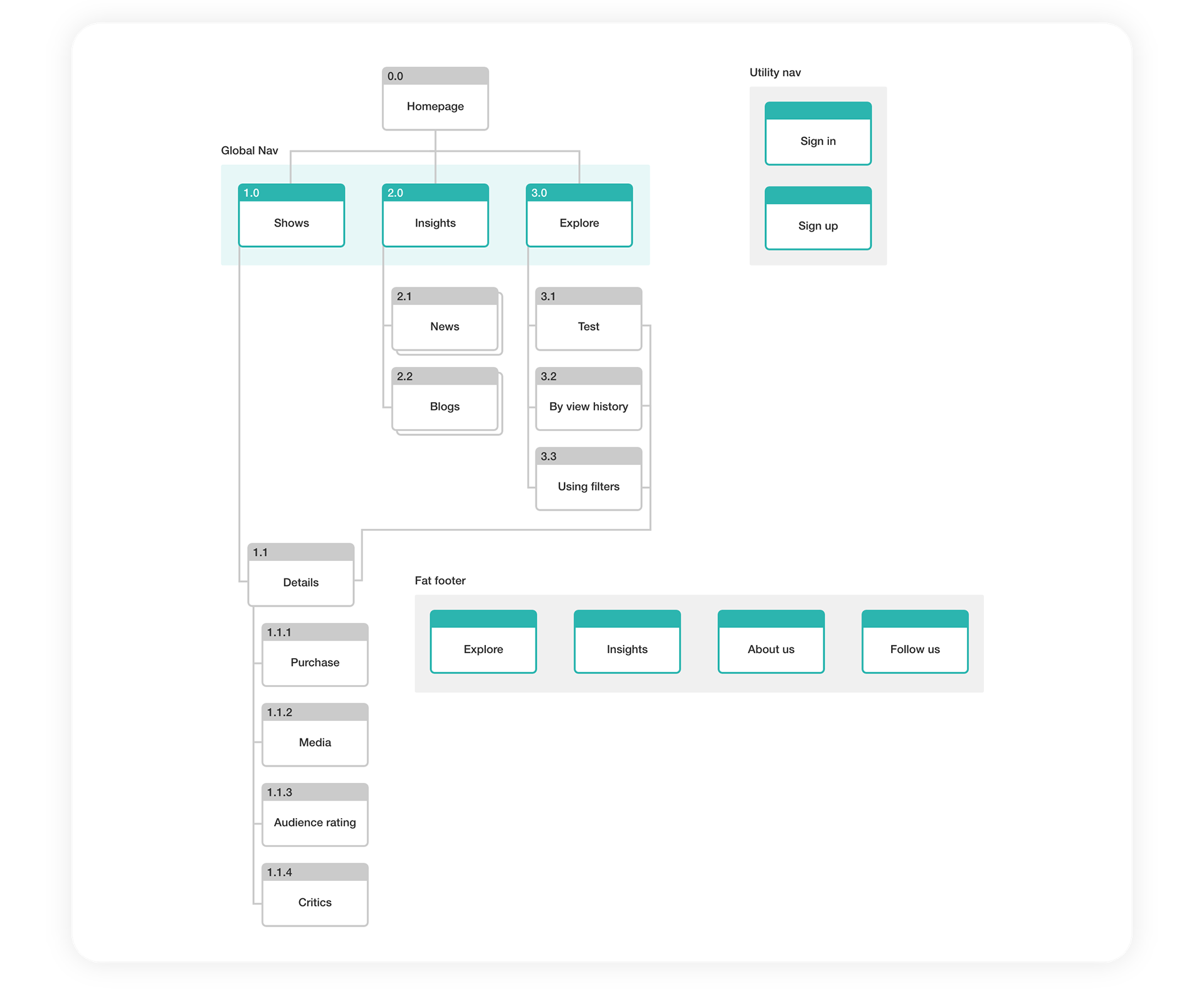
Site map
I used a site map to organize the content of the website.
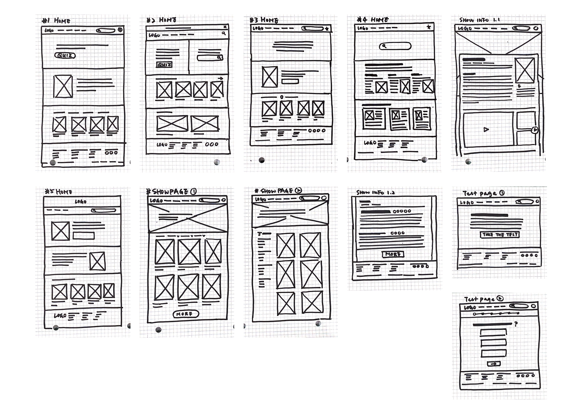
Paper wireframes
After gathering ideas and elements, I sketched out a first draft of the website, focusing on the user flow and quantity.
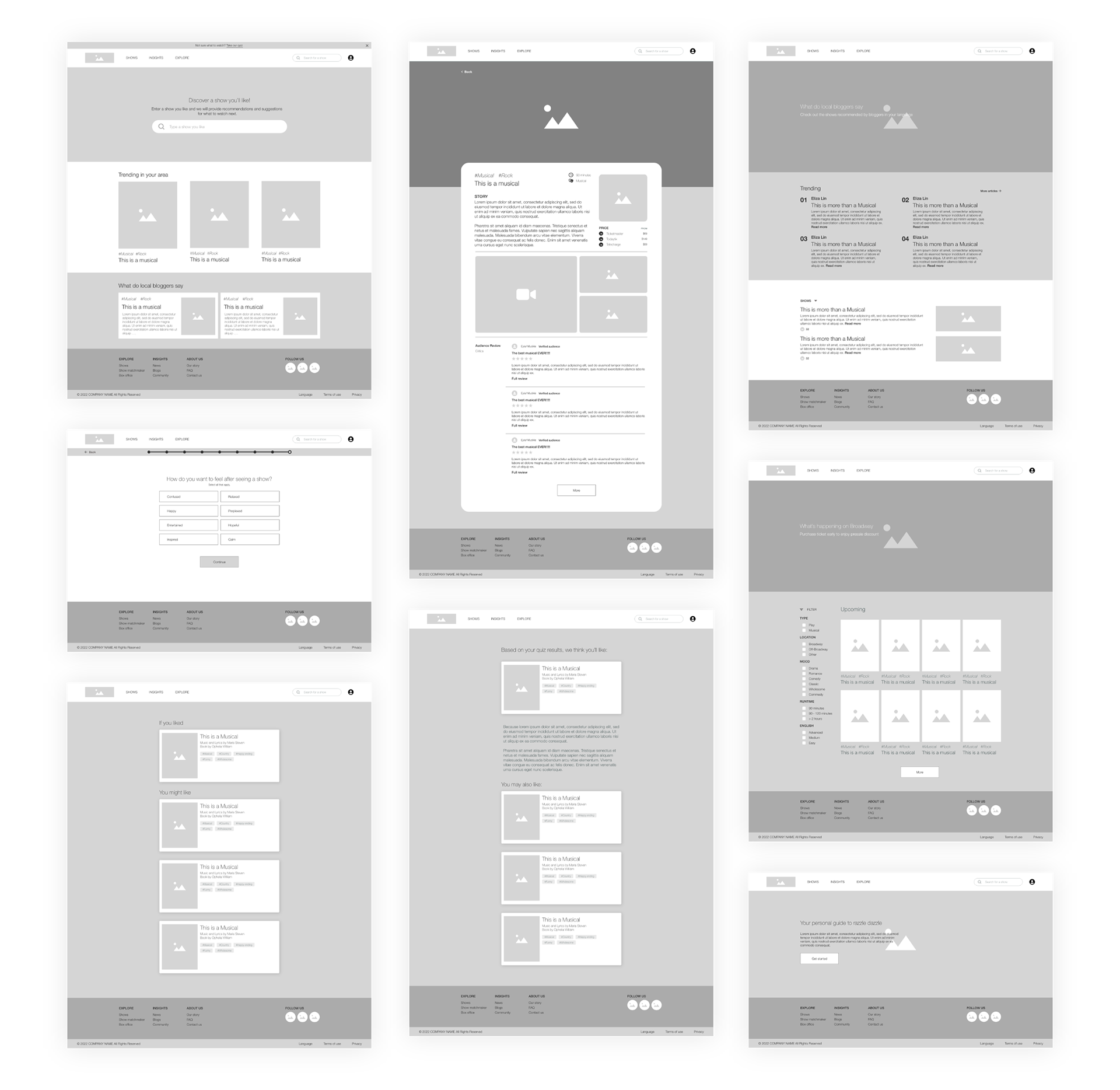
Digital wireframes
With all the elements and ideas visualized, I built the digital wireframes to narrow down my ideas and design features. The goal is to focus on the functionality of the solution.
Prototype
Lo-fi prototype
I built a lo-fi prototype prior to a usability test so the initial concept of the website could be tested with potential users.
Usability test
I conducted a usability test with 5 potential users. Here are some of the themes observed:
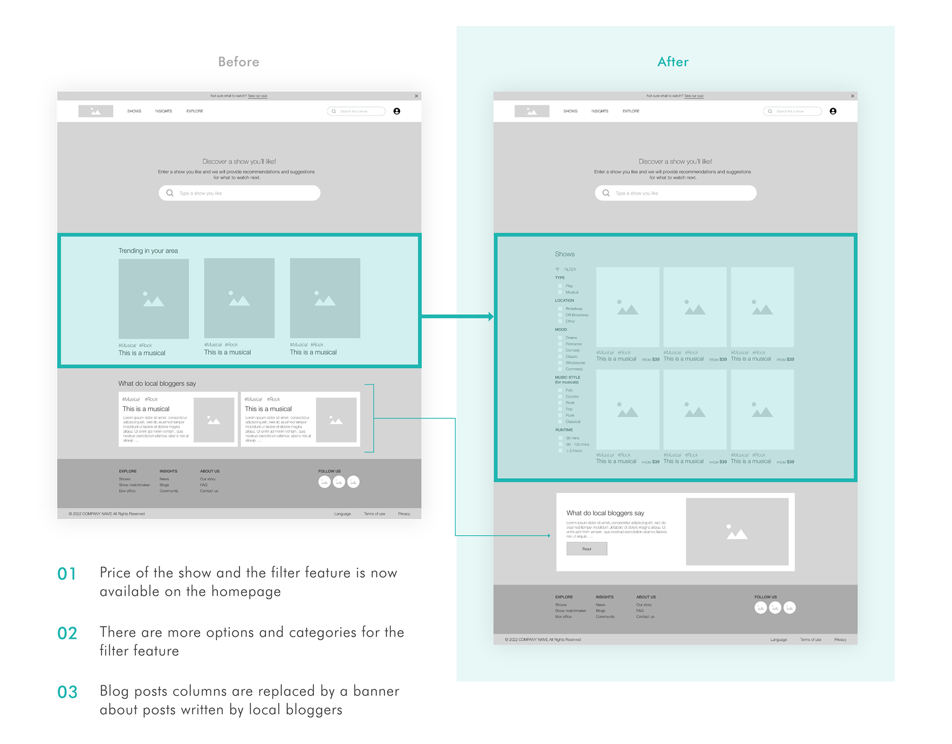
• 4 out of 5 participants found the filtering panel very useful but were confused as to why it was not on the home page.
• 4 of them mentioned they would like to know the price from the beginning.
• None of the participants clicked on the blog posts column on the homepage. I asked if they find the information irrelevant, 3 of them mentioned that the column was too wordy and that if they wanted to read blog posts, they would go to that specific page directly.
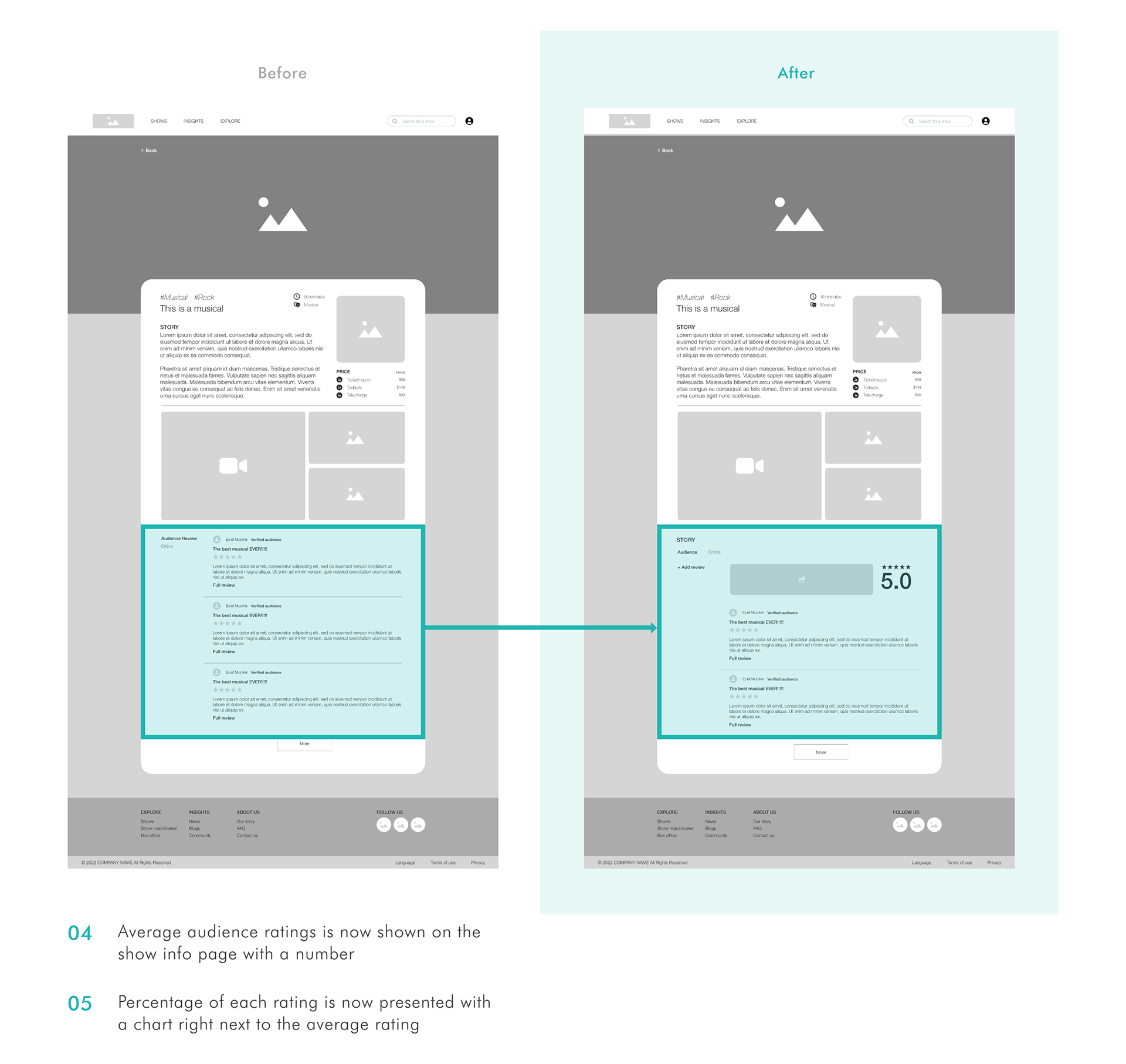
• 3 of the participants found the audience review section unintuitive as there were no average ratings.
Based on the user feedback, I made the following changes to the lo-fi prototype.
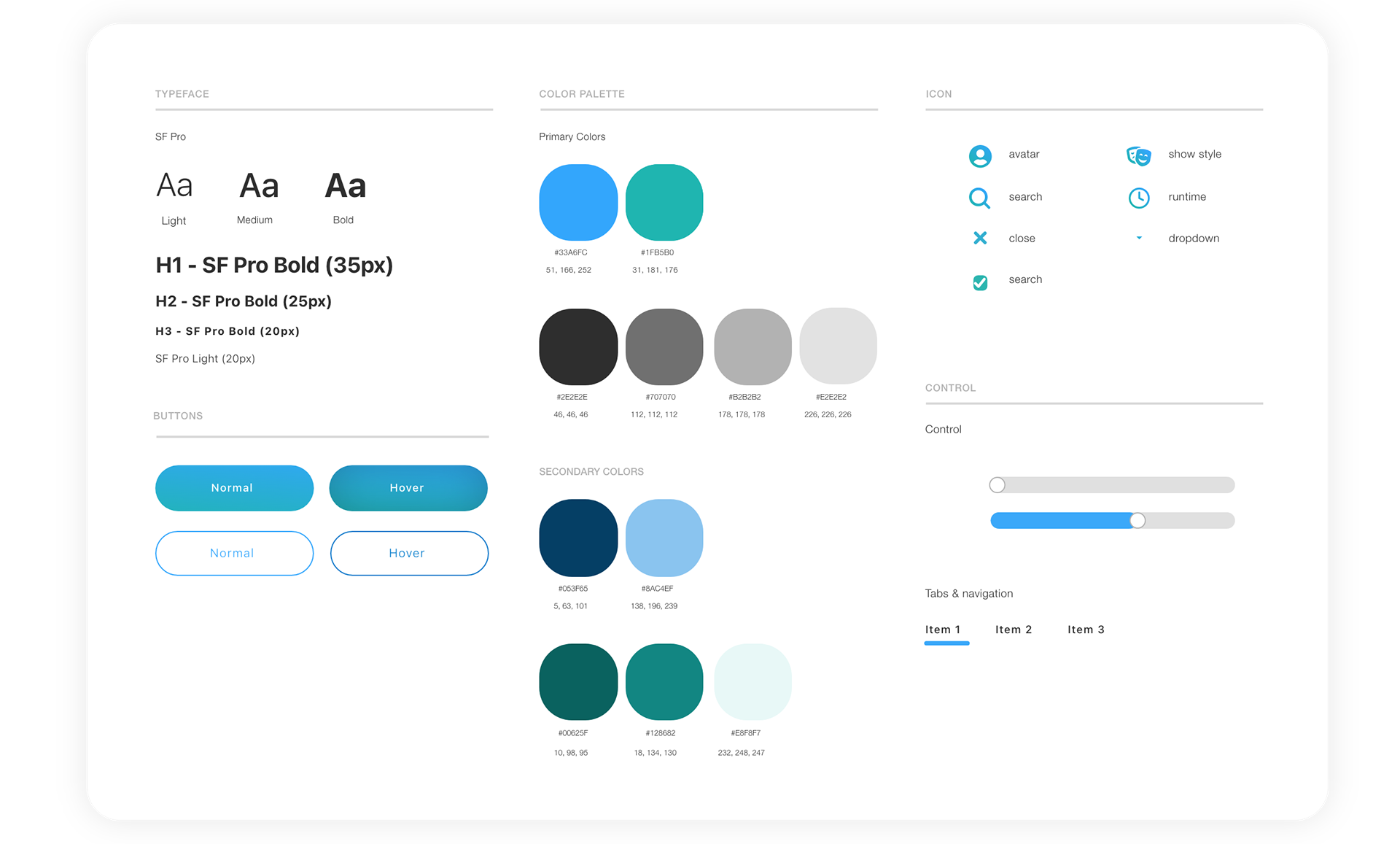
Style guide
A/B Testing
As On Stage provides three methods for users to select shows and I was unsure what would be the best way to lay out the methods, I conducted an A/B testing, targeting 150 participants, and asked participants to pick a design that could help them find a show to watch. The order of the options was switched after 75 people participated to reduce order effect bias.
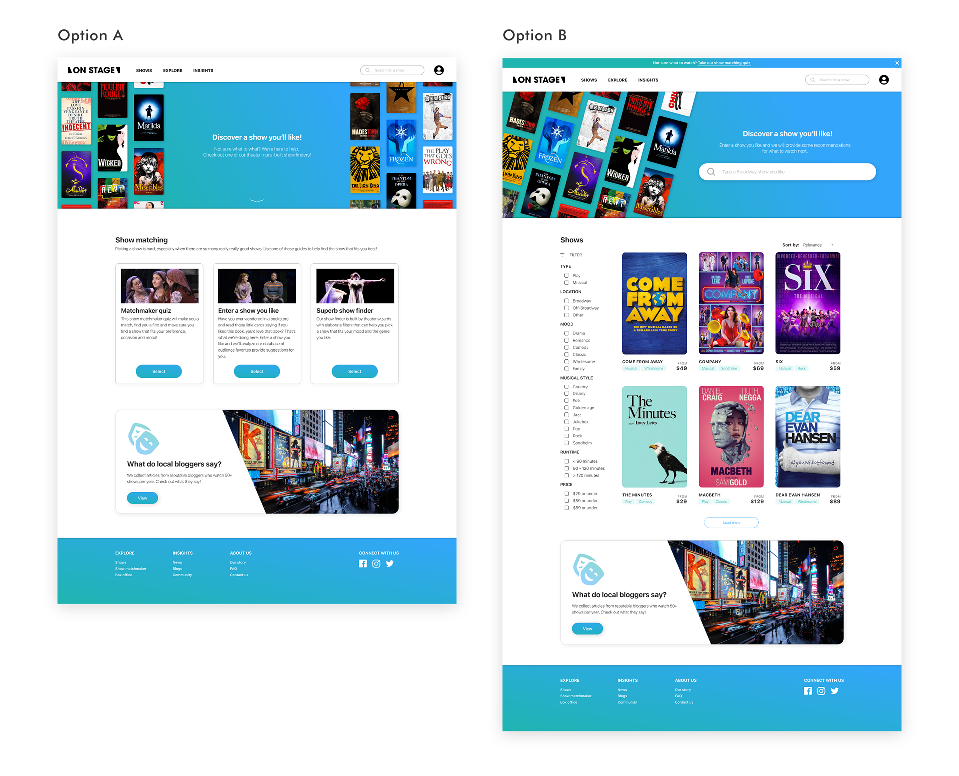
84% of participants chose Option B. In the testing, I asked a follow up question as to why they picked that option. Here are some of the themes participants who chose Option B pointed out:
• Less wordy and easier to navigate
• Fewer decisions the users have to make in terms of what to do
Hi-fi prototype
Here is a clickable hi-fi prototype:
Takeaways & Next steps
Defining users based on research insights
My initial idea was to target foreign theater-goers who do not speak fluent English, like my mom. Excited by the idea, I conducted interviews with people I know, sent out surveys, created a persona and a user journey map. As I saw the numbers from Broadway League stating <20% of Broadway audience was from countries other than the US and >45% of the attendees being US audiences from places outside of New York, I decided to focus on my first step in this group.
Hopefully, if the website is being developed, this will be the next problem to solve. Wait for me, I’m comin’, Mom!
Learning from fellow designers
With this case study, I also contacted a few senior designers for advice. Their advice on my research methods and ideations really improved my processes throughout this case study. This has prompted me to continue to seek insights, from users and designers alike, in the early stages of all my future projects.
Thank you for reading!
↓ Check out my other work ↓